

Hat sich erledigt. Lösung gefunden.
Beiträge von Gerstenzwerg
-
-
Hallo in die Runde,
nach einem Update des genutzten Themes sind die Icons im Header nun unschön nebeneinander angeordnet, sie sollen aber wieder wie vorher untereinander sein (siehe anehängtes Bild). Leider bekomme ich es selbst nicht hin, kann mir jemand helfen? Nachfolgend der aktuelle Code, die Seite ist http://www.wildtierhilfe-rhein-nahe.de.
/* --------TOP BAR --------- */
#topbar {
padding: 12px 0;
color: #fff;
}
#topbar span{
color: #fff;
margin-left: 5px;
font-weight: 10;
letter-spacing: 1px;
}
#topbar h3.custom_title {
display: none;
}
#topbar .custom-social-icons {
text-align: right;
}
#topbar .custom-social-icons i {
color: #000000;
margin: 5px 0;
border: dashed 2px #000000;
padding: 20px 0;
width: 45px;
height: 60px;
text-align: center;
border-radius: 30px;
}
.donate-btn {
margin: 19px 0;
}
.donate-btn a {
border: dashed 2px #000000;
padding: 15px 20px;
font-size: 15px;
font-weight: bold;
color: #000000;
border-radius: 30px;
}
.donate-btn a:hover,
#topbar .custom-social-icons i:hover{
background: #24a500;
border: solid 2px #24a500;
color: #fff;
}
.lower-header {
border: solid 2px #f6f6f6;
border-left: none;
background: #f6f6f6
}
.lower-header {
display: block;}
.icon-space i {
color: #24a500;
font-size: 40px;
margin-right: 10px;
}
.icon-space b {
color: #000;
font-size: 30px;
letter-spacing: 1px;
margin-right: 5px;
}
.icon-space span, .icon-space span a{
color: #585858;
font-weight: bold;
font-size: 30px;
letter-spacing: 1px;
font-style: italic;
}.icon-space span a:hover{
color: #24a500;
}
.icon-space span a:hover{
color: #24a500;
}
.icon-space {
padding: 5px;
border-left: solid 2px #f6f6f6;
} -


Evtl. speichert Dein Theme die Customizer Einstellungen pro Seite wenn Du dort im Vorschau Modus zwischen den Seiten herumklickst und hier oder da publizierst.
Nee, lag wohl irgendwo an der Website selbst. Hab gerade die Website-Cache geleert und nu sieht’s gut aus -
Im Quellcode der Startseite ist hier weiterhin der o.g. alte Code, auf anderen Seiten der neue, seltsamer Effekt.
Komisch, vielleicht hängt deshalb auch die Schriftgrößenanpassung auf der Startseite, auf den anderen ist es richtig. Ich werd morgen noch mal schauen, für heute reicht es mir, dass es jetzt überhaupt auftaucht. -
Weiss nicht wo Du das eingibst, es ist weiterhin der falsche Breakpoint [FONT=Courier New]390px[/FONT] mit nur dem ersten Code aus Antwort #3 im Frontend.
Viel Erfolg mit der Seite.
mE an der richtigen Stelle, oder?
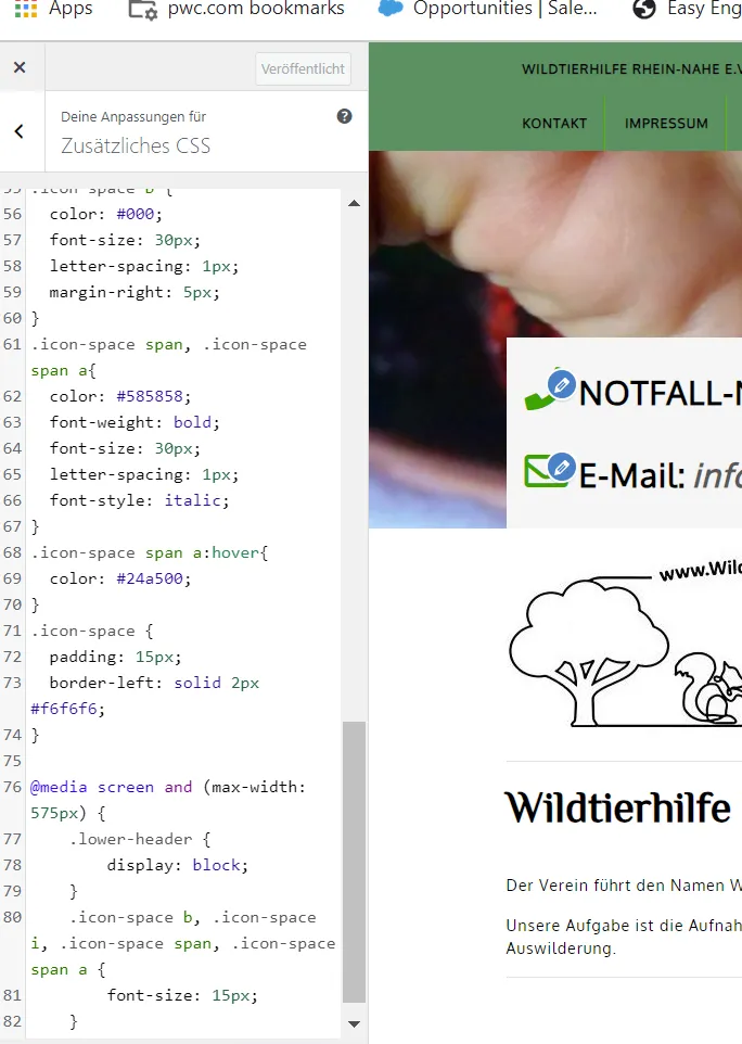
Die Schriftgröße am iPhone ist aber weiterhin nicht kleiner
-
Der o.g. Code gilt für mehr Handys als nur Dein eigenes iPhone, die [FONT=Courier New]575px[/FONT] haben durchaus ihren Sinn, hier mit Schriftgrösse Anpassung:
danke dir, so hab ich es, nur als einzelne Blöcke. Hast mir auf jeden Fall schon sehr geholfen, lieben Dank und einen schönen Abend noch! -
Jetzt ist Code eingefügt worden, aber mit falscher [FONT=Courier New]max-width 390px[/FONT] statt wie oben genannt [FONT=Courier New]575px[/FONT].
ja, hab nur etwas hin und her gedreht, weil es nicht ging. Am Ende hab ich wieder zurück gestellt und es ist am iPhone auf einmal angezeigt worden. Bekomm ich da evtl. auch die Schriftgröße kleiner für die Handy Anzeige? EDIT: Hab glaube ich den richtigen Code gefunden für die Schrift, nur das iPhone setzt es wieder nicht um. Mal schauen, ob es evtl. auch wieder zeitverzögert kommt -
Publiziere die Änderung in Design > Customizer > Zusätzliches CSS, der Code ist noch nicht aktiv im Frontend. Und leere dann ggf. den Browser Cache im Handy.
cache löschen am iPhone hat leider auch nicht geholfen.EDIT: Habe keine Ahnung wieso, aber nachdem ich noch mal an den px hin und her gedreht habe und am Ende wieder bei 575px gelandet bin, ist es jetzt plötzlich da
 Lieben Dank!
 -
in Zusätzliches CSS, der Co
Publiziert habe ich schon. Ich versuchs mal mit cache löschen -
danke dir, hab es eingegeben. In der Vorschau für's Handy erscheint es jetzt auch, mein iPhone 13 zeigt es aber weiterhin nicht an -

Ich sehe am Handy durchaus den Header - aber was ist für dich ein "Lower Header"?
Der graue Kasten hier im Banner, ist als Lower-header definiert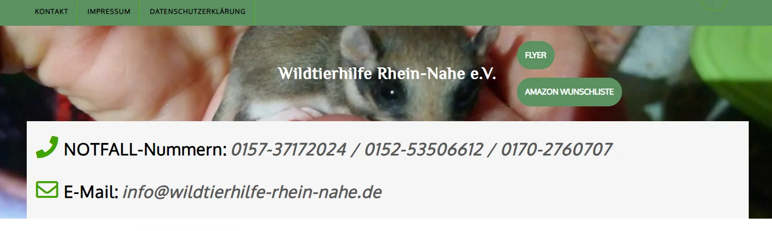
-
Hallo in die Runde,
ich habe folgendes Problem mit unserer Homepage:
Der Header wird auf dem Smartphone nicht automatisch verkleinert, so dass der Lower-Header in dem wichtige Informationen stehen nur auftaucht wenn man manuell auf dem Handy die Schriftart verkleinert oder es quer nutzt.
Ich habe mich zwar schon an ein paar Änderungen die ich online gefunden habe versucht, allerdings alles erfolglos.
Der aktuelle media query Code ist der nachfolgende, Theme st VW Eco Nature, Link zur Website: https://wildtierhilfe-rhein-nahe.de/
Kann mir hier vielleicht jemand helfen?
/*------------------RESPONSIVE MEIDA-------------------*/
@Media screen and (max-width:600px) {
#sidebar h3, #sidebar .wp-block-search .wp-block-search__label{
margin: 0px auto 10px auto;
}
.woocommerce ul.products[class*=columns-] li.product, .woocommerce-page ul.products[class*=columns-] li.product{
width: 100% !important;
}
#slider .inner_carousel,
.search-box,#topbar,.logo,
#topbar .custom-social-icons{
text-align: center;
}
.custom-social-icons{
padding: 5px 0;
}
.logo {
padding: 5px 0;
}
#slider .carousel-control-prev,
#slider .carousel-control-next{
width: auto;
left: auto;
}
#slider .carousel-control-prev{
right: auto;
}
#slider .carousel-caption {
padding: 0;
right: 10%;
left: 10%;
top: 50%;
}
#slider .inner_carousel h1{
font-size: 25px;
}
.serv-box h4{
padding: 10px 0;
font-size: 25px;
}
#slider .inner_carousel p{
display:none;
}
#slider .more-btn a {
padding: 12px 8px;
}
.nav-links{
margin-bottom: 20px;
}
.related.products ul li {
width: 45.75% !important;
}
.serach_inner form.search-form{
max-width: 250px;
}
.serach_inner label {
width: 80%;
}
body.page-template-custom-home-page.admin-bar .header-fixed, body.admin-bar .header-fixed {
margin-top: 0px !important;
}
.copyright .widget, .copyright p {
float: none;
width: 100%;
text-align: center;
}
.wp-block-woocommerce-empty-cart-block ul.wc-block-grid__products{
padding-left: 10px;
padding-right: 10px;
}
.wp-block-woocommerce-empty-cart-block tr.wc-block-cart-items__row {
gap: 0.4em;
}
.wp-block-woocommerce-empty-cart-block td.wc-block-cart-item__total{
padding-left: 0px !important;
}
.wp-block-woocommerce-empty-cart-block li.wc-block-grid__product{
max-width:100% !important;
float:none;
flex: 100% !important;
}
}
@Media screen and (max-width: 1000px){
.menubar .nav ul li a:focus,
a.closebtn.mobile-menu:focus{
outline: 1px solid #000;
}
.toggle-nav {
display: none;
position: relative;
width: 30px;
cursor: pointer;
margin: 0 auto;
}
.toggle-nav i {
font-size: 20px;
color: #fff;
border-left: solid 1px #48b42a;
border-right: solid 1px #48b42a;
padding: 15px;
}
.toggle-nav button {
background: transparent;
border: none;
padding: 0;
}
.sidenav {
height: 100%;
width: 100%;
position: fixed;
z-index: 999999;
left: 0;
top: -110%;
overflow-x: hidden;
overflow-y: scroll;
background: #fff ;
visibility: hidden;
transition: all 0.5s ease-in-out;
cursor: zoom-in;
}
.sidenav.show {
visibility: visible;
top:0%;
}
.sidenav .closebtn {
position: absolute;
right: 25px;
font-size: 36px;
display: block !important;
color: #000;
padding: 0;
top:0;
}
a.closebtn.mobile-menu{
border-right: none;
}
.sidenav #site-navigation {
width: 100%;
}
.toggle-nav span{
font-size:30px;
cursor:pointer;
text-align: right;
}
.toggle-nav{
display: block;
}
.toggle i.fa.fa-bars,.toggle i.fa.fa-times {
float: right;
color: black;
}
.main-navigation ul{
position: relative;
top: 25%;
width: 100%;
text-align: center;
margin-top: 0px;
float: none;
}
.main-navigation ul ul li{
display: block;
}
.menubar .nav ul li{
border-top:1px #f1f1f1 solid;
display:block;
}
.main-navigation ul li a{
padding: 8px;
text-decoration: none;
font-size: 15px;
color: #000;
display: block;
transition: 0.3s;
float: none;
margin: 5px 0;
border-right: none;
}
.main-navigation a:hover {
background: #fff !important;
color: #24a500 !important;
}
.main-navigation ul li ul li a:before{
content:"\00BB \00a0";
}
.main-navigation ul.sub-menu a:hover{
padding-left:20px !important;
background: #fff !important;
}
.main-navigation ul ul{
position: static;
width: 100%;
background: transparent;
border-top-width: 0px;
border-bottom-width: 0px;
box-shadow: none;
}
.main-navigation ul ul a{
border-bottom: none;
text-align: center;
padding-left: 40px;
}
.main-navigation ul ul ul.sub-menu a{
padding-left: 40px;
}
.main-navigation li{
padding: 0;
display: block;
text-align: center;
}
.main-navigation ul li:last-child{
border-bottom: 1px #f1f1f1 solid;
}
.main-header-box{
padding-bottom: 15px;
}
#mySidenav {
text-align: left;
display: inline;
}
.main-menu {
padding: 0em;
padding-top: 50px;
}
.main-navigation ul.sub-menu>li>a:before {
content: unset;
}
.main-navigation ul.sub-menu>li>a:hover:before {
opacity: 0;
left: 0px;
width: 0px;
}
.sf-arrows .sf-with-ul:hover:after,
.main-navigation ul li li:hover .sf-with-ul:after{
content: '\f107';
font-weight: 600;
font-family: 'Font Awesome 5 Free';
color: #000;
}
.sf-arrows .sf-with-ul:after{
content: '\f106';
position: absolute;
height: 0;
width: 0;
border-top-color: #e1e1e1;
color: #000;
font-weight: 600;
font-family: 'Font Awesome 5 Free';
margin-top: 0px;
font-size: 12px;
padding: 0px 10px;
}
#slider img {
height: auto !important;
}
.ad